We love marketing tools and frankly we cannot get enough of them. We are happy to feature new tools at #VCBuzz, especially if they help our members create better more sharable content that spreads well on social media sites.
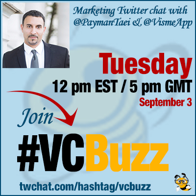
Today we are talking about a nice visual creation and marketing tool called @VismeApp explained to us by its founder @PaymanTaei
***Add #VCBuzz chats to your calendar here.
***Please sign in here to follow the chat -> twchat.com/hashtag/vcbuzz
About @PaymanTaei and @VismeApp
@PaymanTaei is an avid technologist. He loves new trends and tries to keep up with the ever-evolving internet. His background in Biology has led him to truly believe in the art of evolution.
.@PaymanTaei founded @VismeApp in 2013 as one easy-to-use online tool to visualize your ideas for engaging presentations, infographics, and other types of visual content.
Questions we discussed
Q1 How did you become a digital entrepreneur? Please share your career story!
Somewhat accidental. I always had a passion for graphic design and animation but I had never pursuit it. To pay my way through college, I started to design websites (early 2000’s).
Fast forward to ~2009/2010ish I had forgone going to Sports Medicine (grad school) and instead was in my 8th year or running a small Web Agency HindSite Interactive.
Short Version: Out of that, Adobe Flash got disrupted by Apple (was my tool of choice as a designer). Visme was born initially as a replacement for Flash…
…Used by over 3 million users in over 100 countries. That’s my quick little story on entrepreneurship 🙂
Q2 What is @VismeApp? And can it help in content marketing?
Oh great question! It’s sometimes hard to explain exactly what Visme is. Here’s how I like to put it…
First, take the core most needed features of Powerpoint, then Marry it with an easy-to-use Design tool such as Canva… Make it a great working marriage ; a nice balance between the two… And you have Visme: Where you can create not just simple graphics such as for Social Media…
But also full blown engaging Presentations, Infographics, Reports and Charts and everything in between. Visme essentially sits between a simplified restricted tool and the high-end tools such as Adobe. We like to give you best of both worlds.
Q3 Are there some creative visual marketing campaigns @VismeApp can help with? Maybe some examples?
Sure; there are many; but I’ll give you two examples
Say you write a highly informative blog post; and you need to support it with graphics (ex. Infographic) … and snackable visuals to support and improve information retention of key take-aways… in Visme anyone can without being a designer start from our block-based system to create beautiful infographics..
A3. I imagine you want to see what it looks like? We practice what we preach at Visme. We do a lot of that in our blog. For example: https://t.co/I5UczsYsbu #vcbuzz
— Payman Taei (@PaymanTaei) September 3, 2019
Or let’s say you want to create On Demand Webinars or Presentation slide decks that are engaging
A3. You can create them fully in Visme and also embed them to your own site; Here’s an example: https://t.co/CBYTrFplhh #vcbuzz . Hope that helps 🙂
— Payman Taei (@PaymanTaei) September 3, 2019
Q4 Everyone knows popular tools like Powerpoint for Presentations and more recently Canva; how and why is Visme different for content marketing?
I love that question; Why? Because we are asked this almost everyday. Here I go…
A4. Canva is a great tool; but it’s primarily for quick graphics; yes you can do Presentations, infographics but with it’s ease comes a lot of restrictions. Learn more here: https://t.co/EyB5piMJ5P #vcbuzz.
— Payman Taei (@PaymanTaei) September 3, 2019
Let’s talk about the big Elephant in the room! Powerpoint is the goliath that is still sticking around; Love it or Hate it, it ain’t going away anytime soon.
Visme is sometimes by users compared as being Powerpoint on steroids; you get all beautiful slide decks to use as starting point, Insert Video, Add Audio (or record), Present online, make it password protected, create your own Brand Kit, templates, set your own brand colors; and lock them down.
A4. And reuse them (slides, blocks of content, entire presentations);
— Payman Taei (@PaymanTaei) September 3, 2019
I could keep going but i think you get the point 🙂
Learn more here: https://t.co/eblg6bBSVh#vcbuzz.
I like that you are willing to do a head to head comparison. It’s so hard to figure out what software tools do these days. Everyone sounds the same!#vcbuzz
— Anita Campbell (@anitacampbell) September 3, 2019
We try to be as transparent as possible when showing what Visme can do. People deserve to know the facts so they can make better decisions.
Q5 What do you think is the biggest mistake marketers make when using Visuals as part of their content marketing?
They don’t often enough make it a part of their overall content marketing efforts. I’m not saying to go all out with graphics. But don’t be afraid to utilize visuals more into your content strategy.
We are visual beings. Our ancestors used symbols to communicate and today we use icons and visual cues. Somewhere we forgot about it; Visuals I believe are to supplement and support content vs. being depended on mostly as standalone.
I could argue that the biggest mistake is spending too much time on one creative instead of pumping out dozens of visuals to see what works for a specific medium. And then spend time making the winners even better. #vcbuzz
— Boyd Norwood – ⛏️ 15 Years in Digital Marketing (@boydnorwood) September 3, 2019
A/B Testing on visuals is a great tactic. @netflix does it with the covers of the shows and movies. They are constantly testing which covers get more clicks.
On Pinterest, users create 4 or 5 different pins for each blog post. It’s essentially the same tactic. When they have enough data, they can stick to one style of graphic. Keeping track of all the graphics is easy with folders inside the Visme dashboard.
Also, graphics can be turned into templates to use over and over again. So when you know which ones work best, you still have the template and you don’t have to start from scratch all over again.
Q6 Overall, what visual marketing tactics did you see working really well?
At Visme visual marketing that works best for us is to use it consistently with all our content. The longer the content the longer the visuals. Check this out: visuals to drive key points and support content.
Also consistency works well. A very slow (non-sales) method of educating your audience with high-quality free information will improve your brand value, increase organic reach; AKA good evergreen content!
Q7 What are some visual marketing trends you’ve been excited about?
I’ll keep this to one tweet 🙂 Interactivity; be it in form of Gif, Video, HTML5. The visual trend of going back to simplicity (compare your Windows 95 icons to your iPhone X). Great example of : Simplicity to drive visual cues.
Our previous visual content marketing chats:
- Visual Marketing Twitter Chat with Lucinda Watrous @LEWatrous #VCBuzz
- Visual and Content Marketing Twitter Chat with Robert Katai @katairobi #VCBuzz
- How to Use Visual Content In Your Content Marketing
- Video and Podcast Marketing Twitter Chat with Deborah Anderson @socialwebcafe #VCBuzz
- Visual Content Marketing Tips with Nicolina Wroblewski @TheMissNicolina


